A must-see
article | Reading time5 min
A must-see
article | Reading time5 min
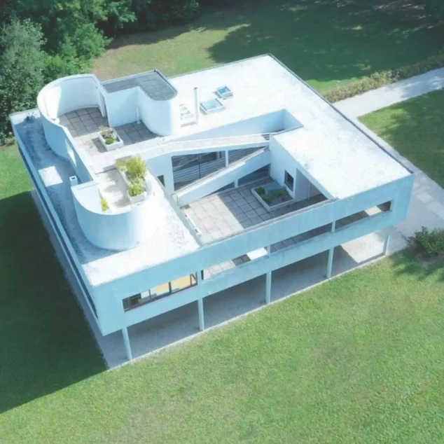
Color is life, and at the villa Savoye, Le Corbusier makes this quote his own. Let's discover its polychromy.
Le Corbusier incorporated color into his designs, as he saw it as part of the spatial construction process.
In 1931, for the Swiss company Salubra, he created a "chromatic keyboard" of 43 shades, which he completed in 1959 with 20 new colors.
This color chart is defined along three major axes: space interacts with color, color reveals objects and color acts physiologically on people.
© Benjamin Gavaudo / Centre des monuments nationaux © FLC (Fondation Le Corbusier) - ADAGP
Pale colors bring warmth and light, while stronger hues enhance or conceal.
The perfect illustration can be seen as soon as you arrive in front of the villa, with the dark green or "English green" camouflaging the first floor and integrating it with the surrounding meadow, topped by the white of the upper floor : the villa seems like a box in the air !
Jean-Christophe Ballot / Centre des monuments nationaux © FLC (Fondation Le Corbusier) - ADAGP
Although white is the villa's dominant color, we know from the polychrome research campaigns that 8 shades of the "Salubra" range were used for the interiors.
The paints created by Le Corbusier have a matte finish, meet very precise requirements and are still produced today.
© Jean-Christophe Ballot / Centre des monuments nationaux © FLC (Fondation Le Corbusier) - ADAGP